OmniCloud
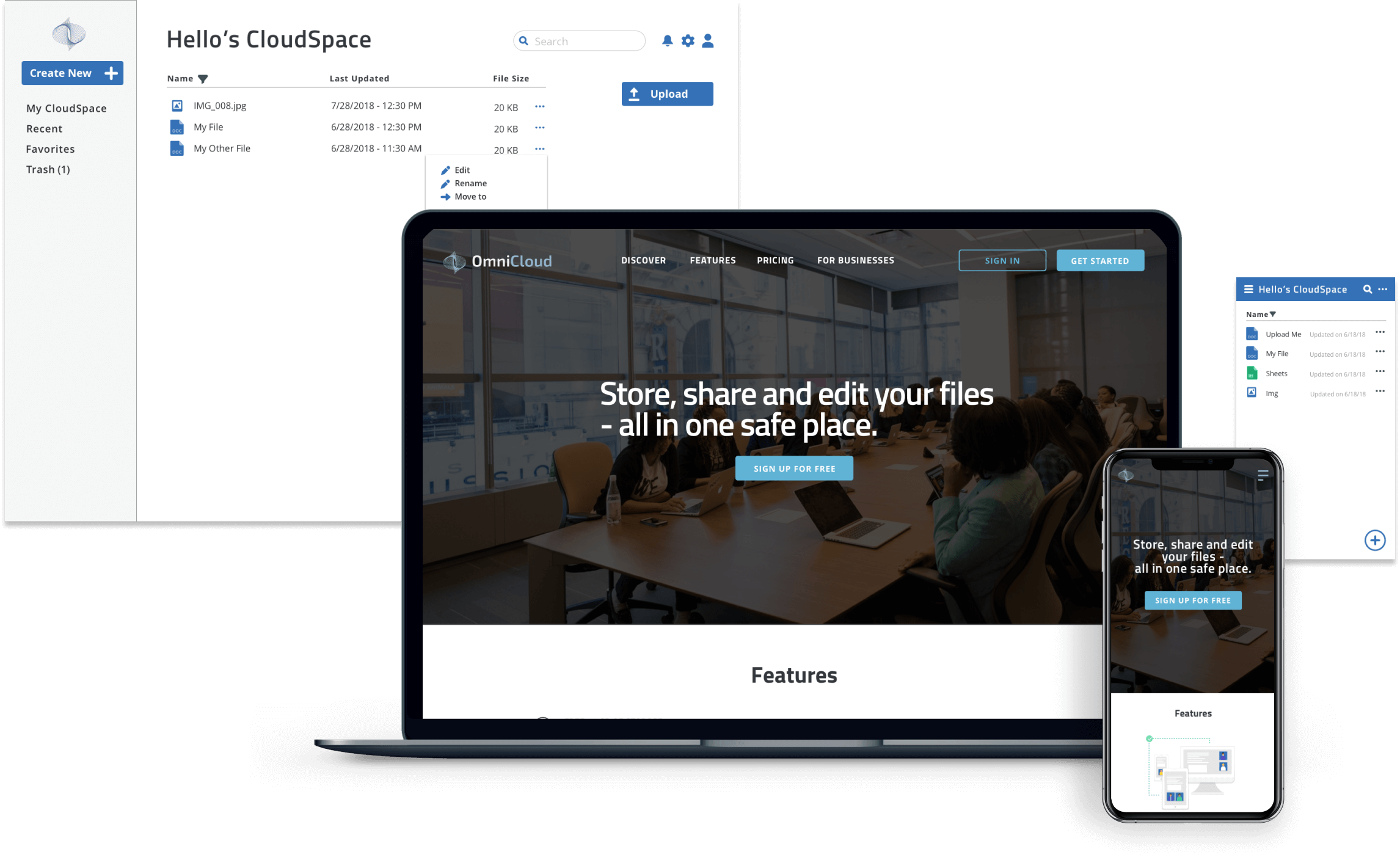
OmniCloud is a lightweight cloud storage service that lets you store, customize, share, and work on files all in one place.
Roles
- UX Researcher
- Content Strategist
- Visual Designer
- UX Designer
Deliverables
- Competitive analysis
- Survey results
- User personas
- Sitemap
- Wireframes
- High fidelity prototypes
Tools
- Sketch
- Balsamiq
- UsabilityHub
- InVision
Overview
Problem
Cloud storage apps are widely known for securing digital assets such as photos and documents. More recently, editing and collaborating on content have become popular features. The problem is that the apps tend to be more complex, leaving users more overwhelmed and frustrated.
Solution
I designed OmniCloud to be more simple and lightweight, while offering a full suite of features, where users can create, edit, collaborate, and securely store content in one place. Synchronizing in real time, a user can feel confident that their content is always up to date.
My Approach
01
02
03
Evaluate
Research
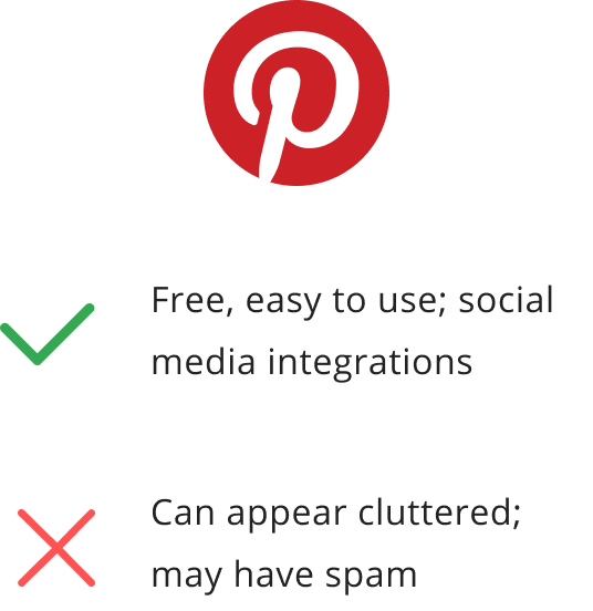
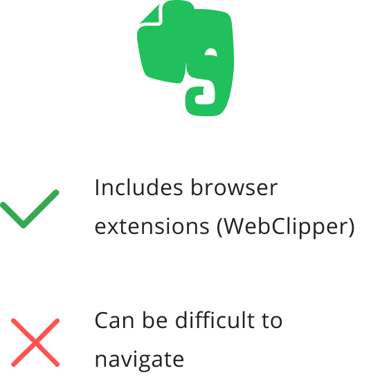
Competitive Analysis: Exploring the Market
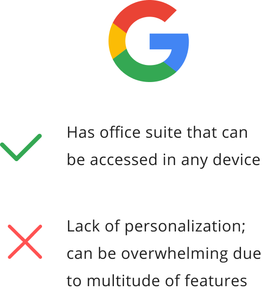
To begin, I explored the market to determine if existing apps helped users create and edit content. My competitive analysis looked into three major competitors that catered to specific interests. Here are my findings:
Survey
In addition to understanding the competition, I wanted to capture users' thoughts about cloud storage apps through a survey. Here are the key findings among the 32 students and young professionals between the ages of 18-34. A majority of them use well-known cloud storage apps such as Google Drive and DropBox.
- 50% of users utilize cloud storage apps for personal use and typically store, create, edit and collaborate on files
- 70% find it helpful for cloud storage apps to be accessible across devices
- About half of respondents find that web interface and security could be improved.
- There were mixed reviews on collaboration features, yet those who favor them used cloud storage apps for business
Interviews and User Personas
To understand our users better, I interviewed three individuals about themselves, their daily habits, and their experiences with cloud storage apps. The interview style was largely open-ended. Here are the key takeaways:
- Need to have their files synchronized and accessible in both desktop and mobile.
- 1 of 3 did not care for collaboration features
- Would be nice to keep app less complex
These insights helped me discover two types of users: the casual user and the expert user. The casual user uses one to two main features such as uploading photos, while the expert uses multiple features such as editing and collaborating on files. These findings were laid out into the following personas:

Goals
To find an easy, secure and free way to store essays, notes, and photos.
Frustrations
- Not enough storage
- Some features can be excessive
Motivations
- Easy-to-use interface
- Able to use app in phone and laptop

Goals
To keep digital assets secure; to be more efficient through collaborative work
Frustrations
- Not enough storage space in premium
- Privacy and security are questionable
Motivations
- Able to collaborate in real time
- Efficient, versatile app
Do My Client's Needs = User Needs?
Now that I understood the needs of the two types of users, I re-examined the requirements from the stakeholders to see how their needs align with that of our users.
Requirements:
- saving content you find on the web (links, images, videos, etc.)
- organizing that content using things like categories, tags, groups, and/or folders
- creating content (notes, documents, maybe spreadsheets?)
- uploading files (videos, images, PDFs, etc.) from a computer or mobile device
- sharing a single item with someone else (and vice-versa)
- sharing a folder or group of items with someone else (and vice-versa)
- connecting with other users for real-time collaboration in notes or documents
Do user and stakeholder needs align? Almost. It depends on the type of user.
I realized that the expert user would not only benefit from basic cloud storage app features, but would also prefer to connect with others for real-time collaboration on projects. Given that only a few cloud storage apps offer this set of features, I decided to keep the expert users’ needs in mind while constructing the app.
User Stories, Flows, and Information Architecture
To map out the interactions of the main features, I listed user stories from low to high priority for both new users and returning users. During the sketching and wireframing process, items high on the priority list were included in the minimum viable product.
User stories based on priority
High
- Onboarding
- Creating a new file
- Editing and deleting files
- Organizing content
- Uploading content
- Sharing content
- Collaboration features
- Signing out
Medium
- Account settings
- Creating tags or labels
- Seeing changes made by collaborators
- Search bar
- Accessing app on another device
Low
- Profile settings
- FAQs
- Tutorials
- Business plan
- Update subscription plan
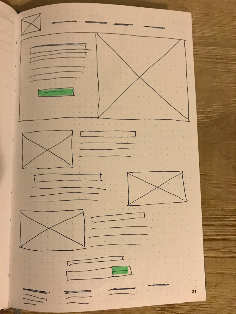
To visualize these processes, I sketched user flows for items in high priority. I aimed to simplify these stories by keeping familiar flows.
Mapping out the onboarding process
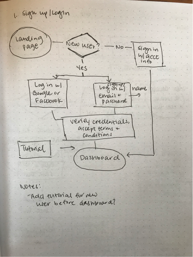
The onboarding process, for example, has been a target of complaints by survey responders
The onboarding process, for example, has been a target of complaints by survey responders
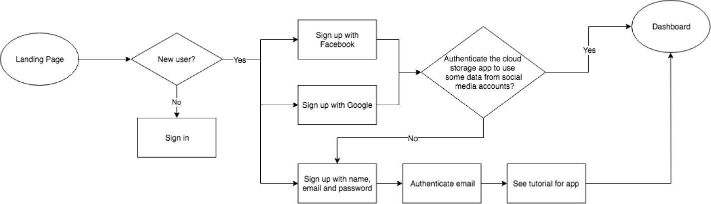
After feedback and refinement, I mapped the flows digitally for improved legibility.
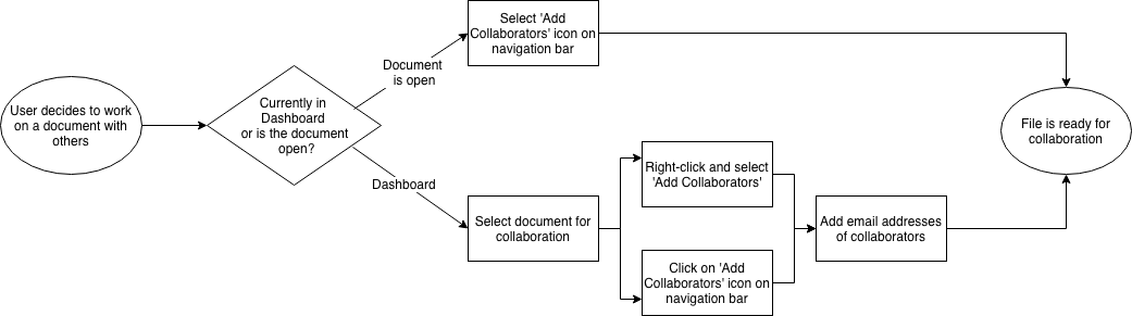
Mapping out collaboration flows
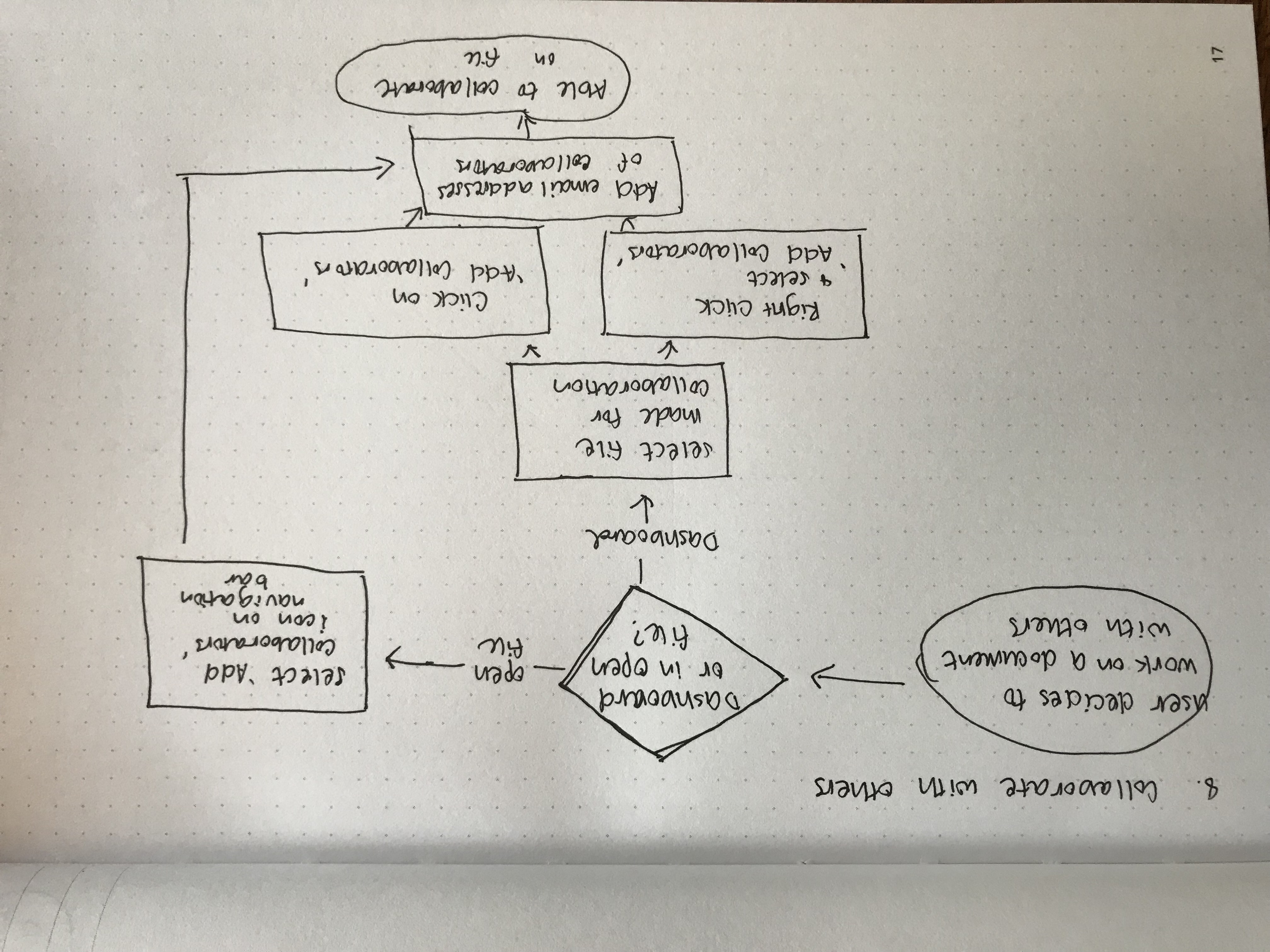
Laying out the collaboration process
Laying out the collaboration process
Wireframes and Testing
With prioritized user flows, I began piecing together the elements in rough sketches and wireframes. Using Balsamiq, I created initial wireframes for the landing page, dashboard, and other primary user flows.
Visualizing the landing page
The aim was to invite visitors to sign up and try our product. This would be achieved with an attractive hero image, caption, and call-to-action button. Underneath the hero section are lists of features.
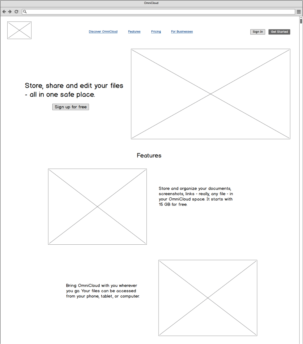
To put this into perspective, I created the digital version with the following changes:
- Added content on the navigation menu, hero, and feature sections for context
- Added the sign up and sign in buttons on the top left corner
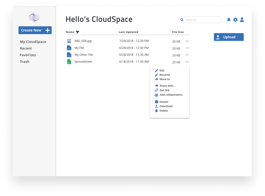
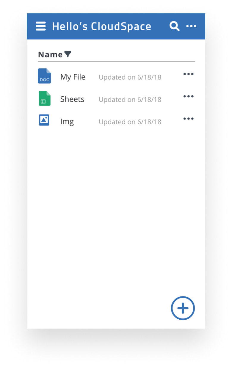
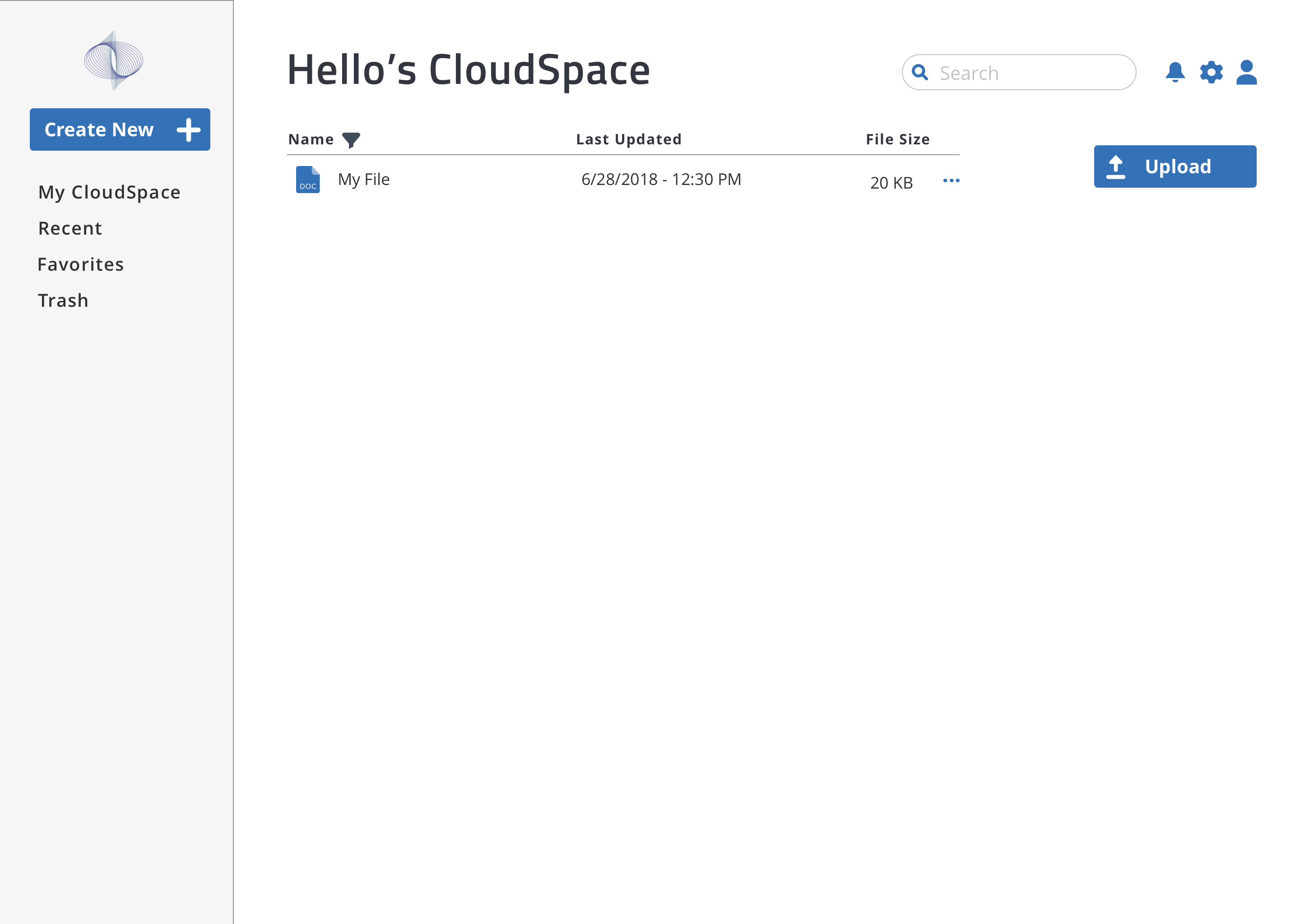
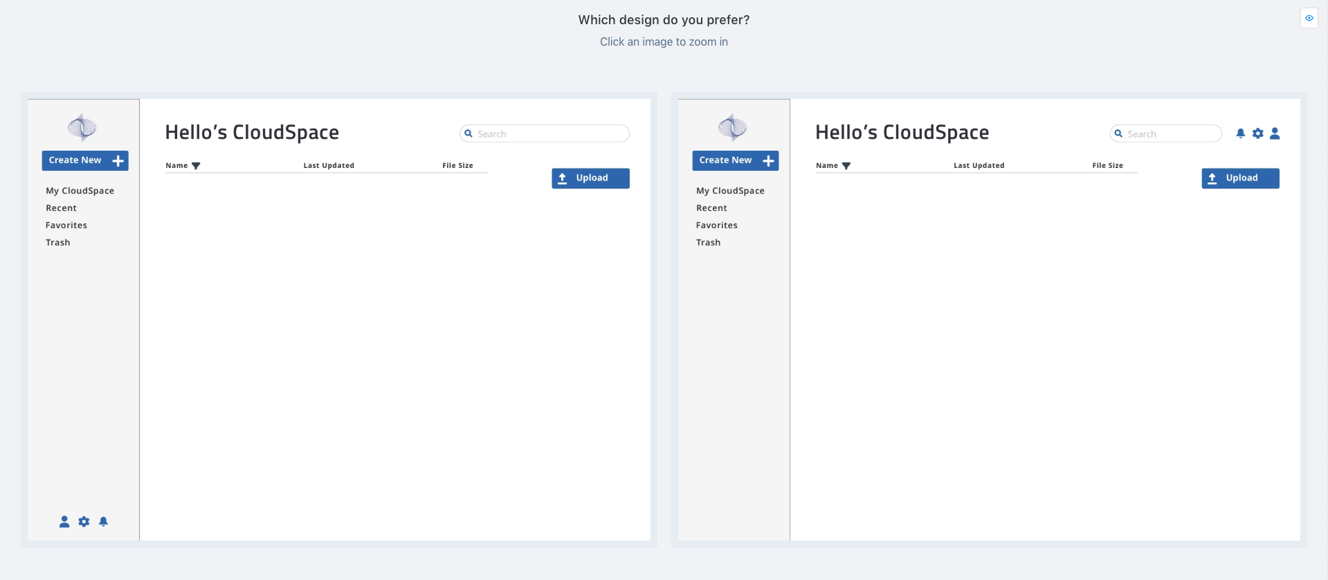
Drafting the dashboard
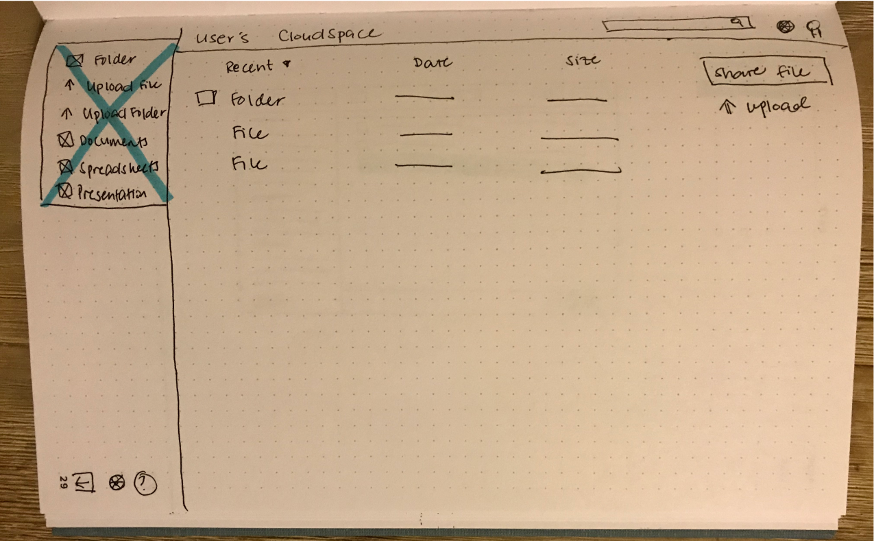
The goal was to arrange elements in a minimalistic, sensible design. The primary menu would be on the left, the content in the center, and other features on the right. Settings and log out buttons would be on the bottom left.
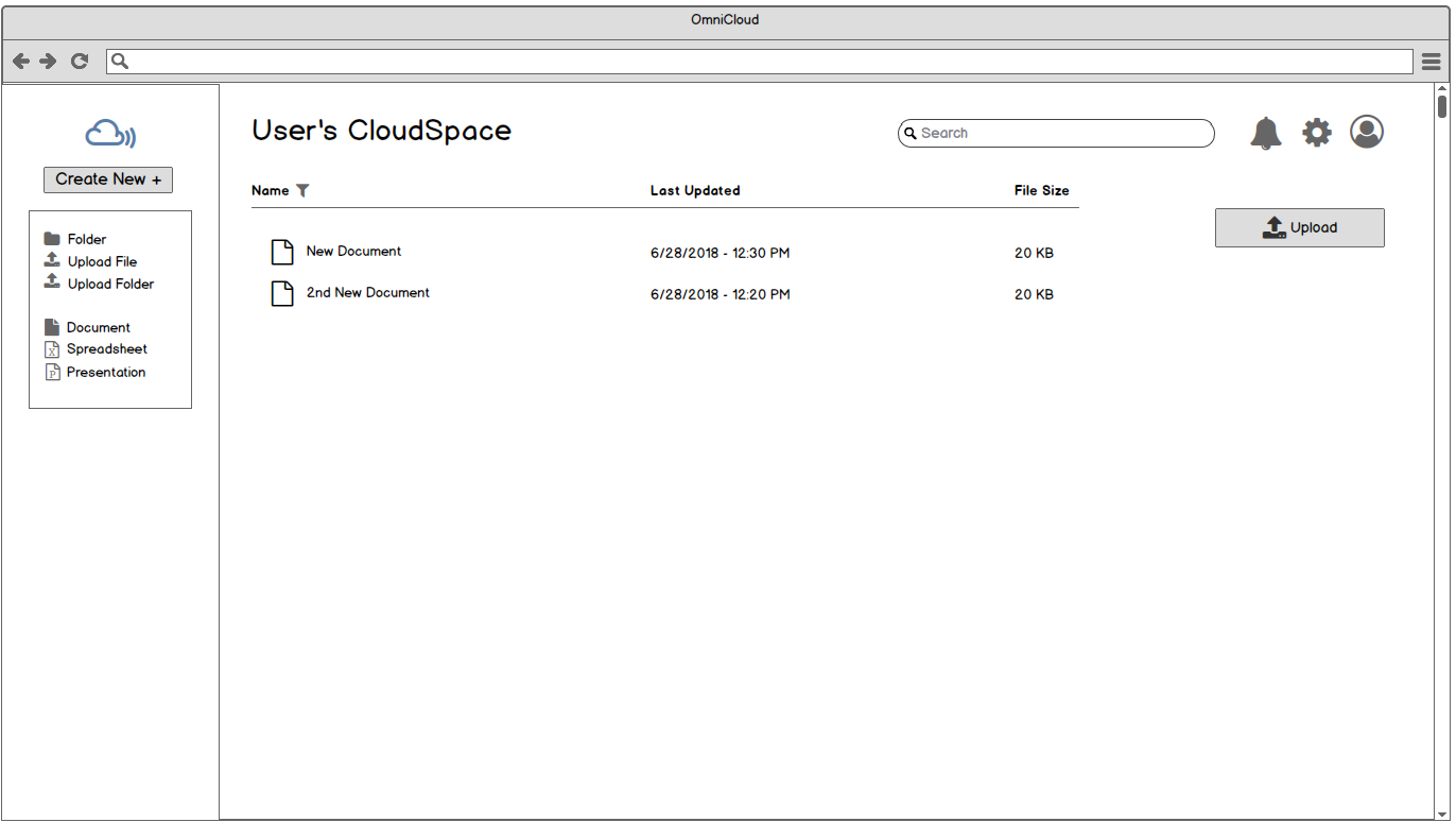
The dashboard was refined by having the following updates:
- Added logo and "create new" button above the primary menu
- Removed the share file button to lessen clutter on the secondary menu
- Moved the settings and log out icons to join the profile and notification icons on the upper right corner
Testing Usability with Wireframes
To test my assumptions about appropriate placements of elements, I conducted remote usability tests with two individuals. Testers were tasked to do three tasks:
- 1. signing up for an account
- 2. adding a piece of content
- 3. organizing content
The key results were positive:
- Users found the tasks to be simple and straightforward
- Suggestions came up about adding a tutorial and other convenient interactions such as clicking-and-dragging items into a folder
Design
Brand Identity
To give the product life and personality, I decided to first work on its brand identity.
The origin of the name OmniCloud: Thinking about the words versatility and boundless to describe this app’s capabilities, I thought about the prefix omni meaning “all” and combined it with the nature of this project, the cloud storage app.
The name “OmniCloud” could remind someone of something robust, reliable, secure and highly regarded.
Keeping this in mind, I developed the following:
- Mission Statement: to equip professionals with robust, reliable and secure tools that will make their everyday work life simpler.
- Vision: to see OmniCloud as a popular choice across companies, schools, and collaborative spaces
- Target Audience: students and professionals from age 18 and above
- Brand Voice: conversational, friendly, welcoming and instructive
- Brand Personality: think of a supervisor or mentor who is knowledgeable, firm and caring
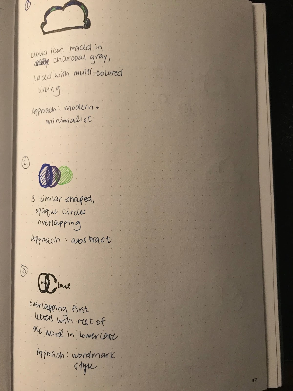
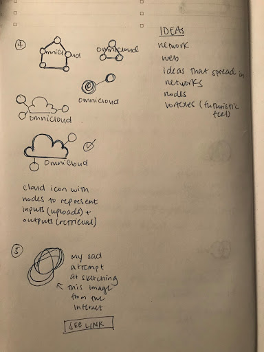
Crafting OmniCloud’s Style Guide
When I thought of the name OmniCloud, I envisioned a sleek and modern logo with nodes, vortexes, and webs to depict the networks OmniCloud can reach through sharing and collaboration.
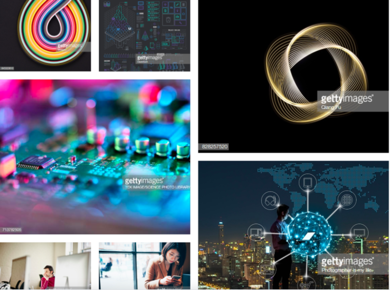
Conceptualizing the feel of OmniCloud through mood boards
First ideas in sketches - both analog and digital
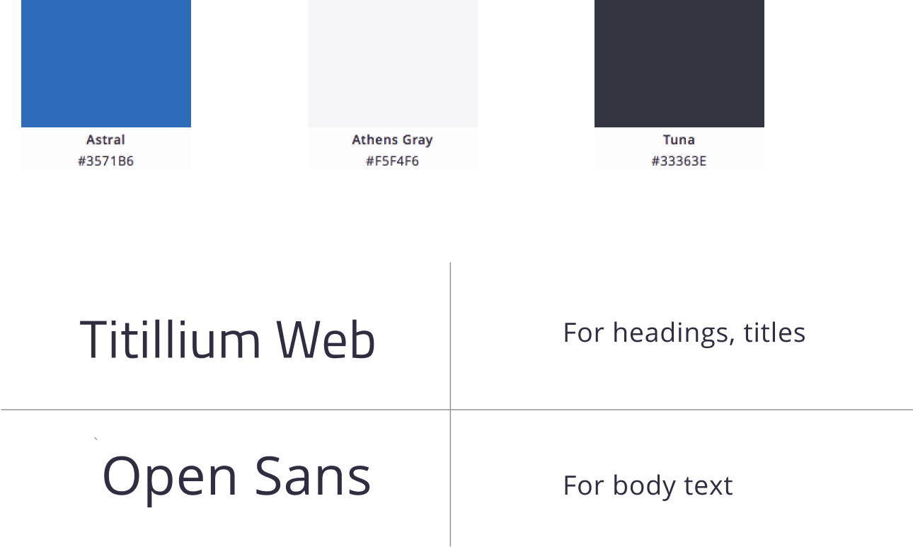
Ultimately, I decided to piece sets of ellipses together and included a logotype with a futuristic font and dual-color scheme. These details reflect OmniCloud’s expertise, professionalism, and openness to evolve as a modern cloud storage application.
To further assist users in feeling the sense of professionalism, robustness, and reliability, the following color palettes and typography were selected. For more details, check out the OmniCloud Style Guide.
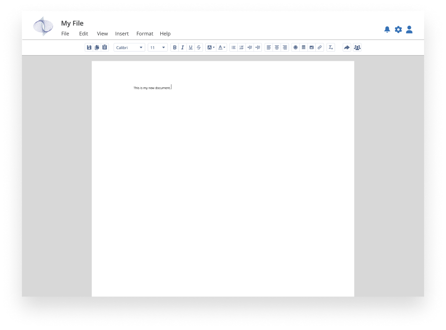
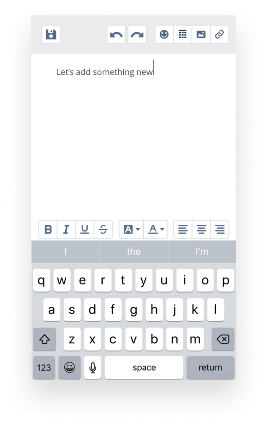
Adding Visual Design to Wireframes: Creating First Round of High Fidelity Mockups
With feedback gathered about layouts and additional features, I developed high-fidelity mockups for both desktop and mobile views with Sketch and InVision.
Evaluate
1st Iteration: Testing High-Fidelity Mockups' User Flows, Style, and Brand
I conducted usability tests on three individuals. I asked them to not only sign up for a new account, add content, and organize items, but to also share files and add collaborators. Here are the most notable suggestions:
- Did not like having the sign up or sign in window open on another page
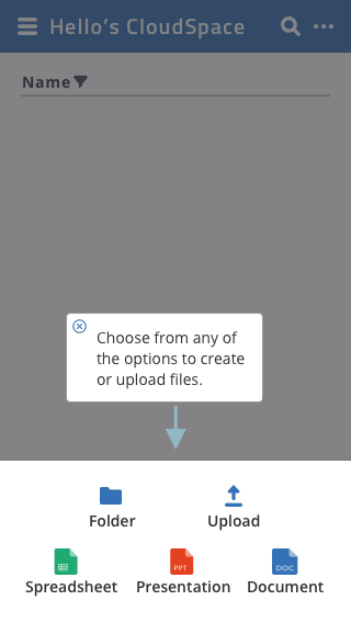
- Instead of adding a gray overlay on selected files, add ellipses to encourage users to seek more options
Before
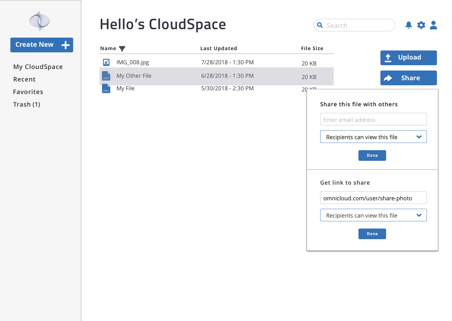
When the file is hovered, a gray overlay would appear to indicate that you can do more to the file (e.g. delete or move it)
After
The overlay was replaced by an ellipse, as it is a common indicator for more options
- Menu for mobile looks confusing when it is scattered; stacking it like the file menu window might help with legibility
Before
The idea was to keep this design unique and accessible for tapping from either side of the mobile device.
After
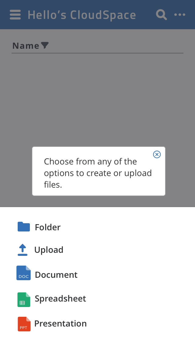
Arranging icons as a list helps users find an item more easily. To select an option, the user can simply tap the row of their icon of choice.
Users were also asked about their general opinions of OmniCloud, its brand and whether they would be motivated to use the app in the future. Here were their thoughts:
- They felt that the app was simple, intuitive, and professional
- Some remarked that they would not need to use the text editor, but would use the app to store files such as photos from their devices
- Those who found the editing features helpful would intend on using it again in the future
2nd Iteration: Preference Tests for Style and Function
Taking recent suggestions into consideration, I revised parts of the OmniCloud desktop and mobile mockups and conducted another usability test to determine what new users preferred. Using UsabilityHub, I sent out a brief preference test with the following design comparisons:
Results: Settings
Over 60% preferred to have the settings icons on the top right of the dashboard. The thought that it was more intuitive and made sense to pair it close to the search bar.
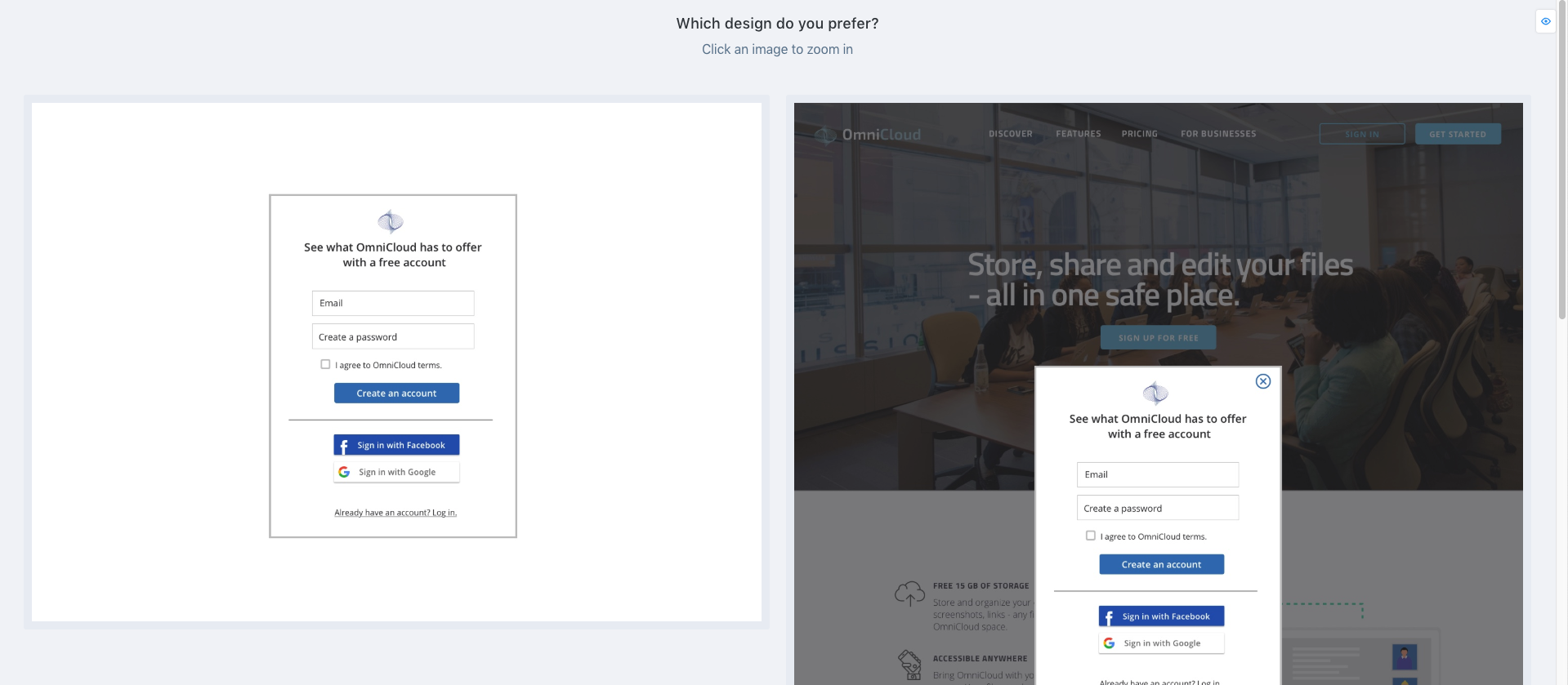
Results: Sign Up/Sign In Form
About 90% preferred to have the Sign Up/Sign In form as a modal on the landing page. They thought this was more interesting and felt that it was more direct.
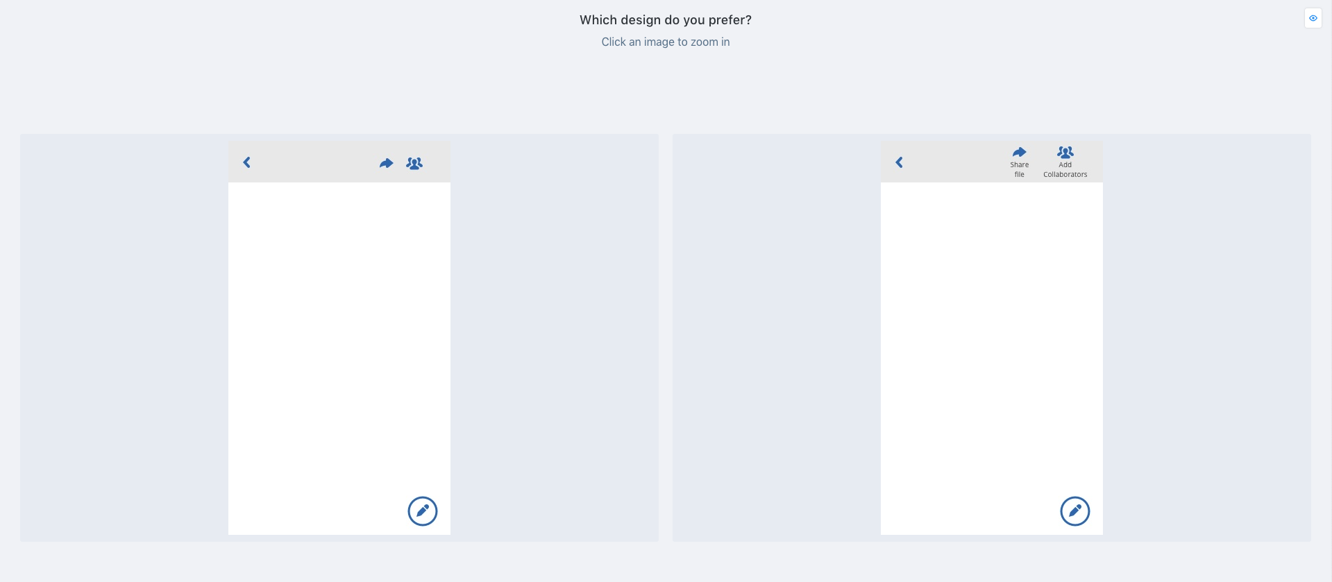
Results: Labels for Text Editor Icons
About 75% preferred to have labels underneath the icons on the top navigation bar of the text editor. They like icons being made clear for them.
3rd Iteration: Polishing Features
Taking these findings into consideration, I polished the mockups and updated their prototypes. You can view the latest prototypes here:
Conclusion
Lessons Learned
Looking back at OmniCloud’s development, there were certain points in the journey that were enlightening. During the discovery phase, I learned that the majority of users’ needs did not always align with those of my client, the stakeholders. To set a compromise between these expectations became an immediate challenge. I learned that one needs to think outside the box and research deeper to address this issue. I learned that by researching and testing early and frequently, your project would be spared from trouble down the line.
I also learned to embrace iteration, but to also be mindful of deadlines. Iterations debunk our initial assumptions about the “best version” of our product, but they could be time-consuming. I learned that minimizing scope creeps and establishing design systems early in the creative process would save time and avoid missing deadlines.
Overall, this project helped me become more confident in my research and design thinking skills. Going forward, I plan on refining OmniCloud through additional testing and iterations of new features such as security.